
Breaking the Rules

I’ve never been good at sticking to the rules. Maybe I have a rebellious streak or maybe I simply have a logical mind and just can’t bring myself to slavishly follow rules I find to be arbitrary. And a lot of them seem to be arbitrary!
Those of you with even a passing interest in photography will likely have heard of the Rule of Thirds. The Rule of Thirds is a photo composition technique that involves dividing a photo into three symmetrical sections both vertically and horizontally and then placing the subject of your photo either along one of the lines or at one of the intersecting points. If you have an horizon in your photo the conventional wisdom would be to place the horizon along either the upper or lower line, but not straight across the middle of the photo.
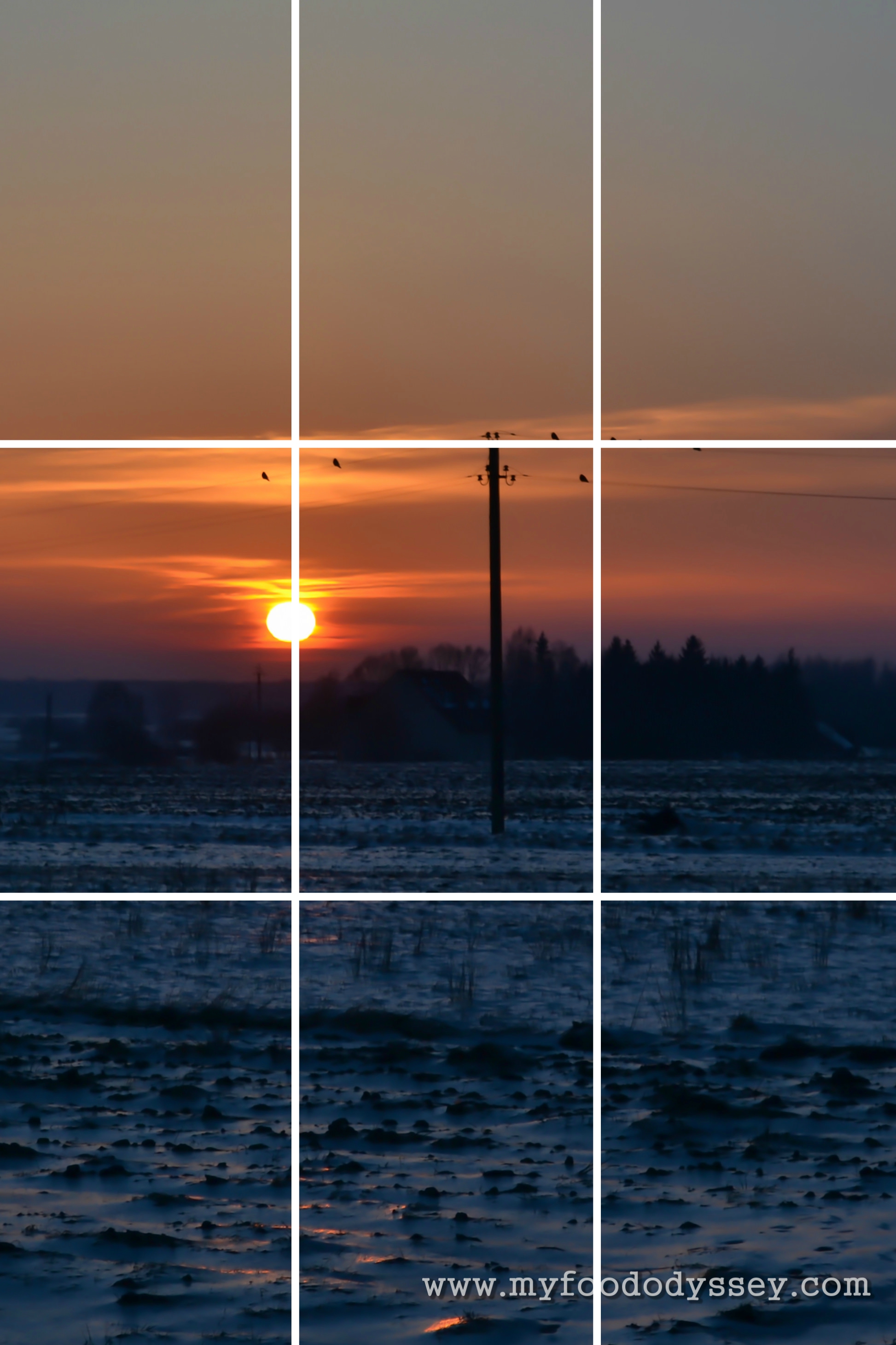
Three horizontal lines and three vertical lines make a grid on the photo with nine sections and four intersecting points.
Somehow, inexplicably, the rule seems to work. Photos that follow the rule are more interesting to look at and more pleasing to the eye. Most of the time, that is. Sometimes you need to break the rule to get the best composition for your photo.
This week’s photo challenge was to share a photo that clearly had two halves. This would mean breaking the rule of thirds, at least in part of the composition. I played around with some photos I took of a sunset last winter. In most photos I placed the horizon straight across the centre of the photo and then varied the other elements in the photo, such as the position of the sun and the trees. Sometimes placing items on the dividing lines worked and sometimes it didn’t. Here’s a selection for you. What do you think – does following the rules work?
Like what you see? Then please subscribe to My Food Odyssey. Alternatively you can follow me on Facebook, Twitter and Pinterest.
Photo 1:
Note that you can click on any photo to enlarge it.
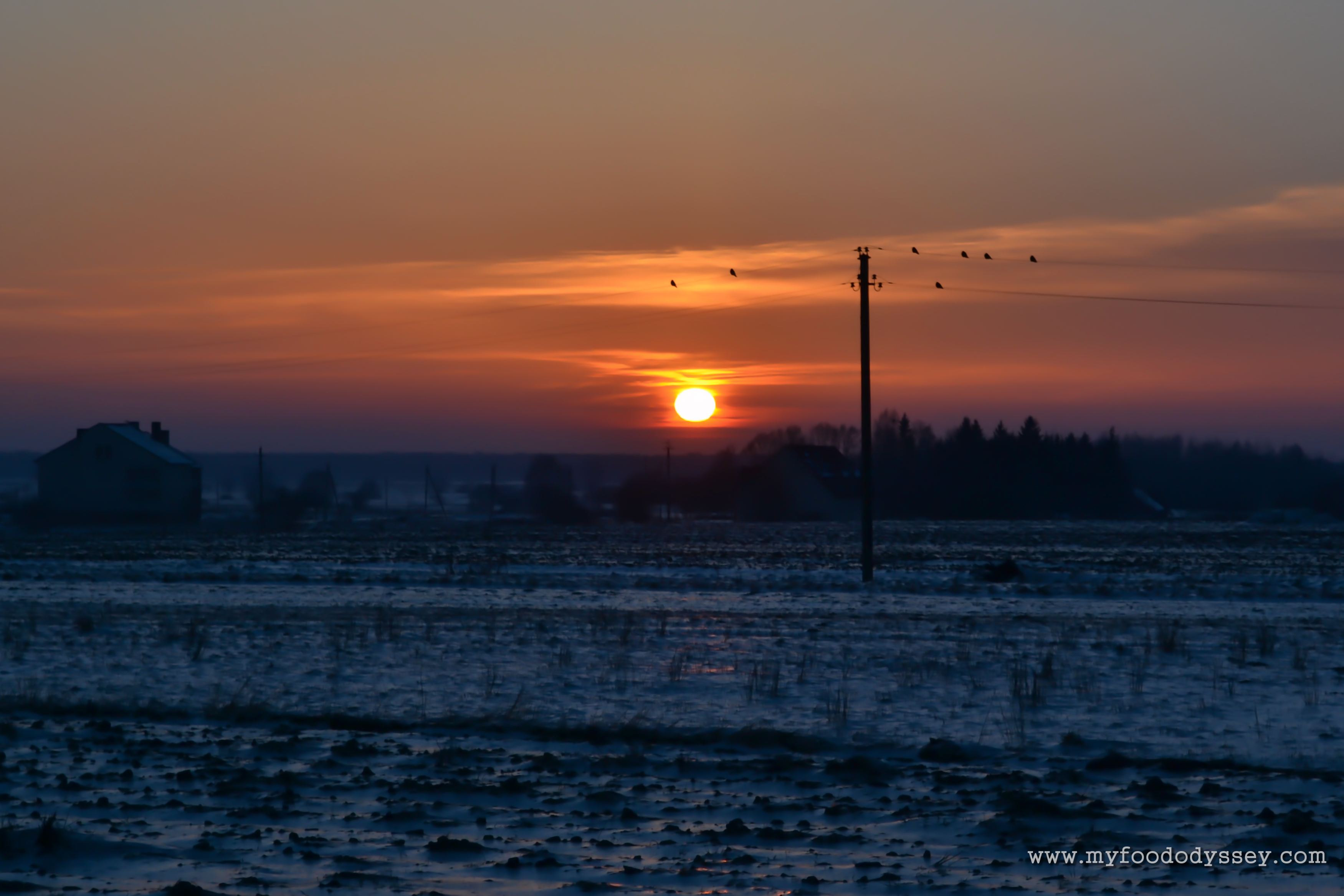
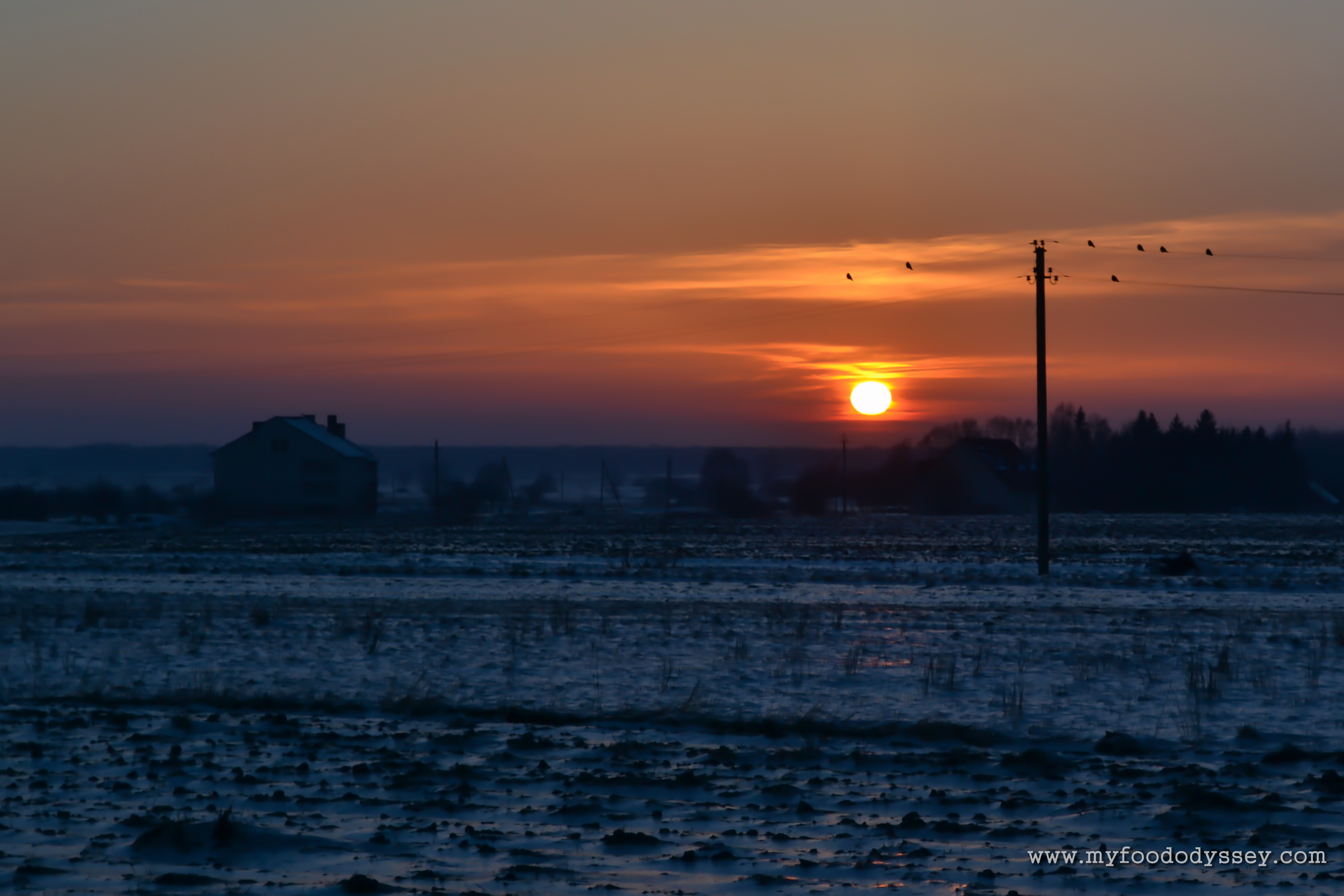
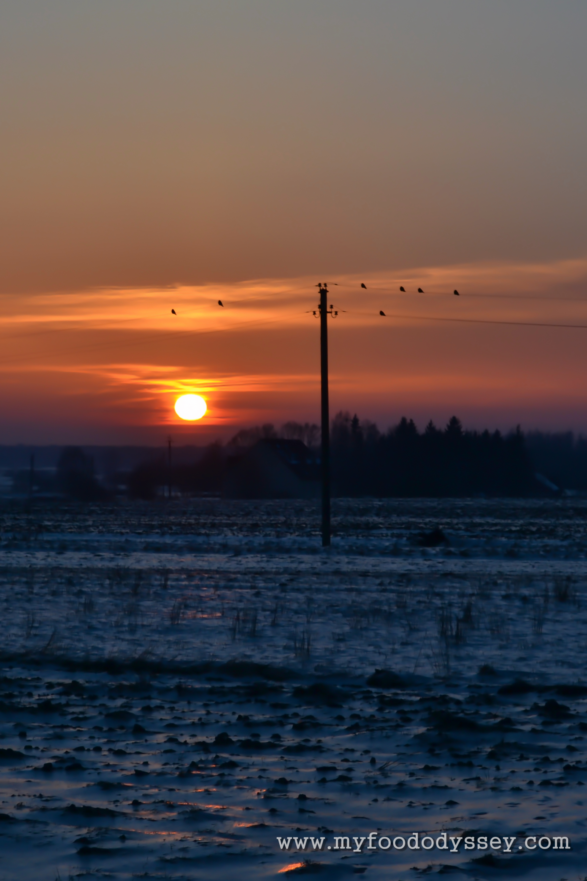
In this photo the horizon is centered and the sun is positioned across the central vertical. I’m not mad about this composition. There’s a gap on the horizon on the right side and the house looks like it’s pushed off to the left. The birds are neither here nor there.
Here the horizon is centered and the sun is positioned across the right vertical. To me this is a much nicer composition. There’s a symmetry between the house on the left and the pole on the right. The birds seem to stand out more and add to the composition.
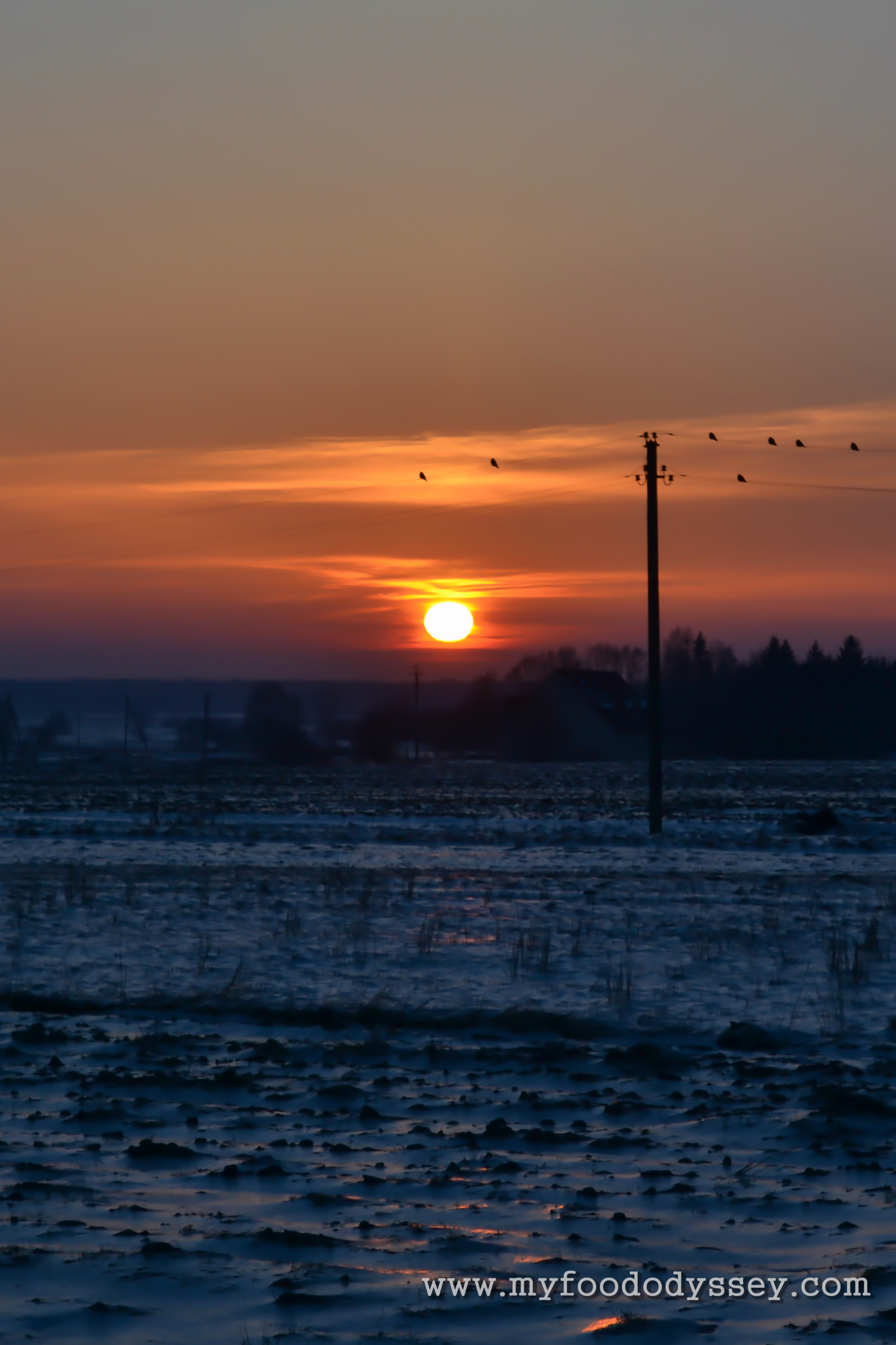
This portrait version of the photo leaves out the house on the left completely. The sun is centered but because the photo is narrow the birds stretch across the entire right side of the photo. I like this version.
Here the sun is centered across the left vertical which leaves the pole and the birds more or less in the centre. This is my favourite portrait version.
Photo 2:
This is more or less the original photo. The horizon is centred and the sun is just left of centre. There is a symmetry between the gaps from tree to edge on each side of the photo.
This version is almost identical to the original except that the sun is placed across the left vertical. This changes the symmetry of the trees which to my mind is less pleasing to the eye.
Here the sun is centered. I don’t think this composition works very well.
Here the horizon is placed on the lower horizontal. While the sky portion of the photo is more attractive than the snow portion I find this version to be out of balance compared with the versions where the horizon is centered.
Here the horizon is placed on the upper horizontal. The balance of soft sky to harsh snow is now out of whack. This composition doesn’t work for me.
In this portrait version the sun is centered on the right vertical. The symmetry of the trees is a little off, but it’s not a bad version.
Here the sun is centered. There is more symmetry across the trees which I find appealing. I think I prefer this to the previous version.
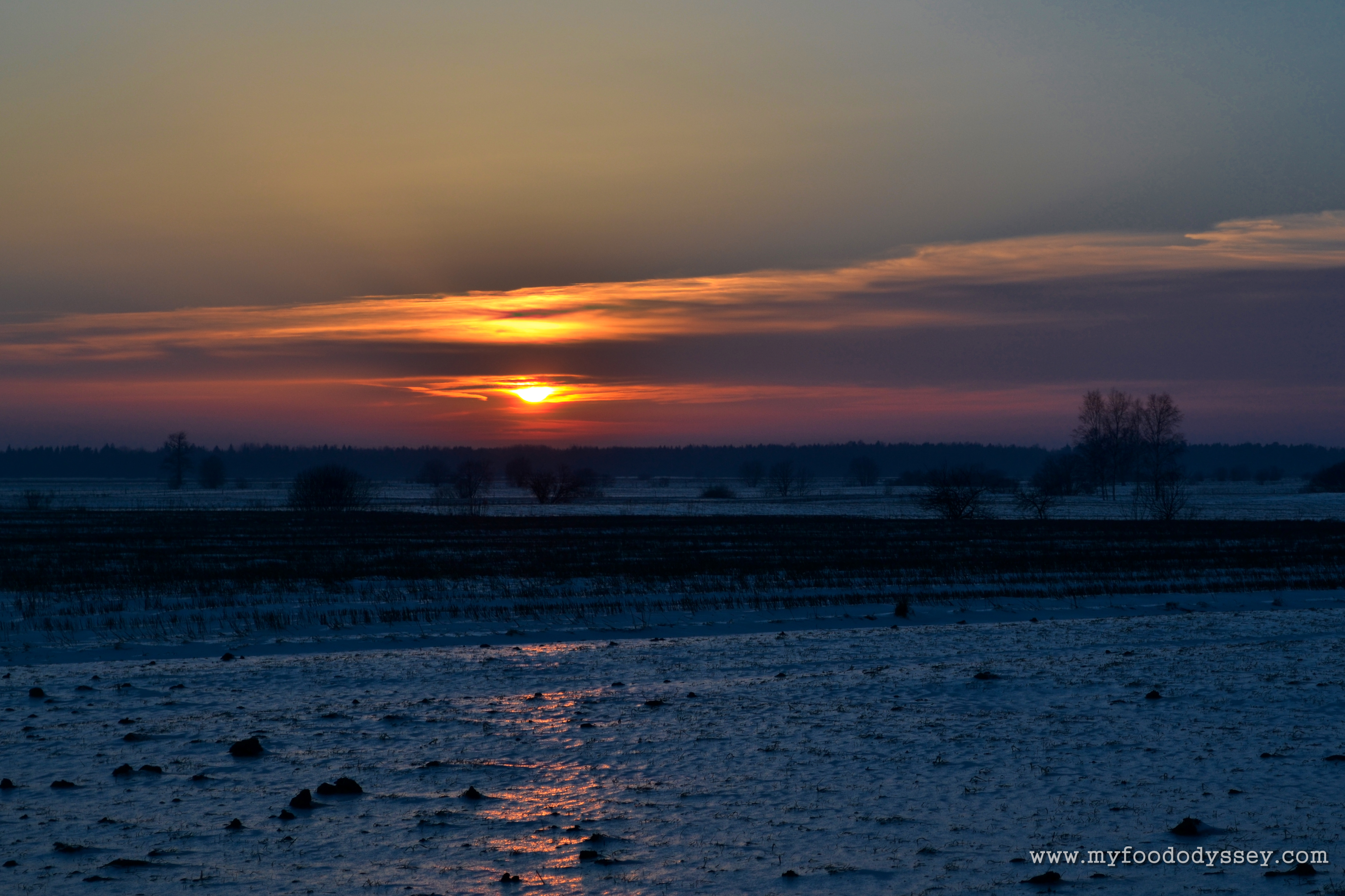
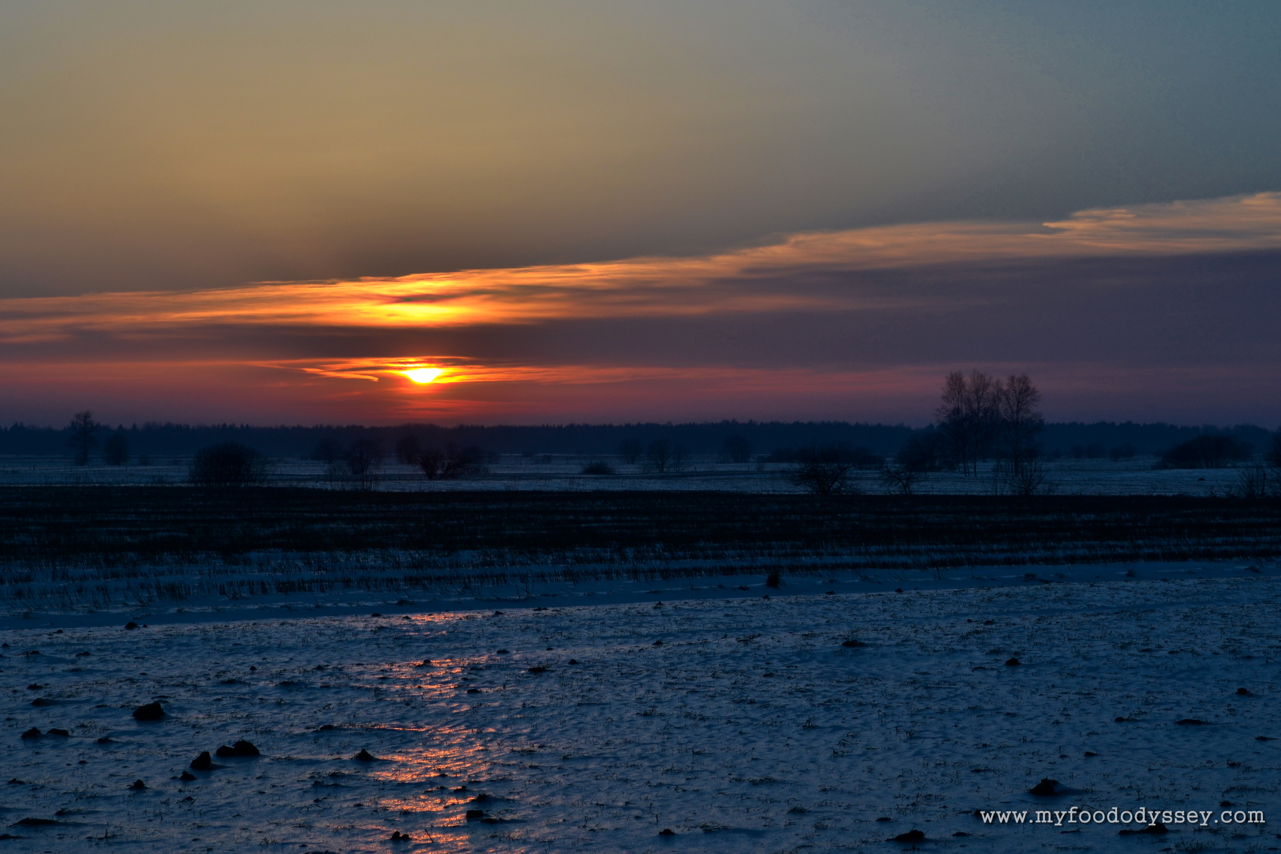
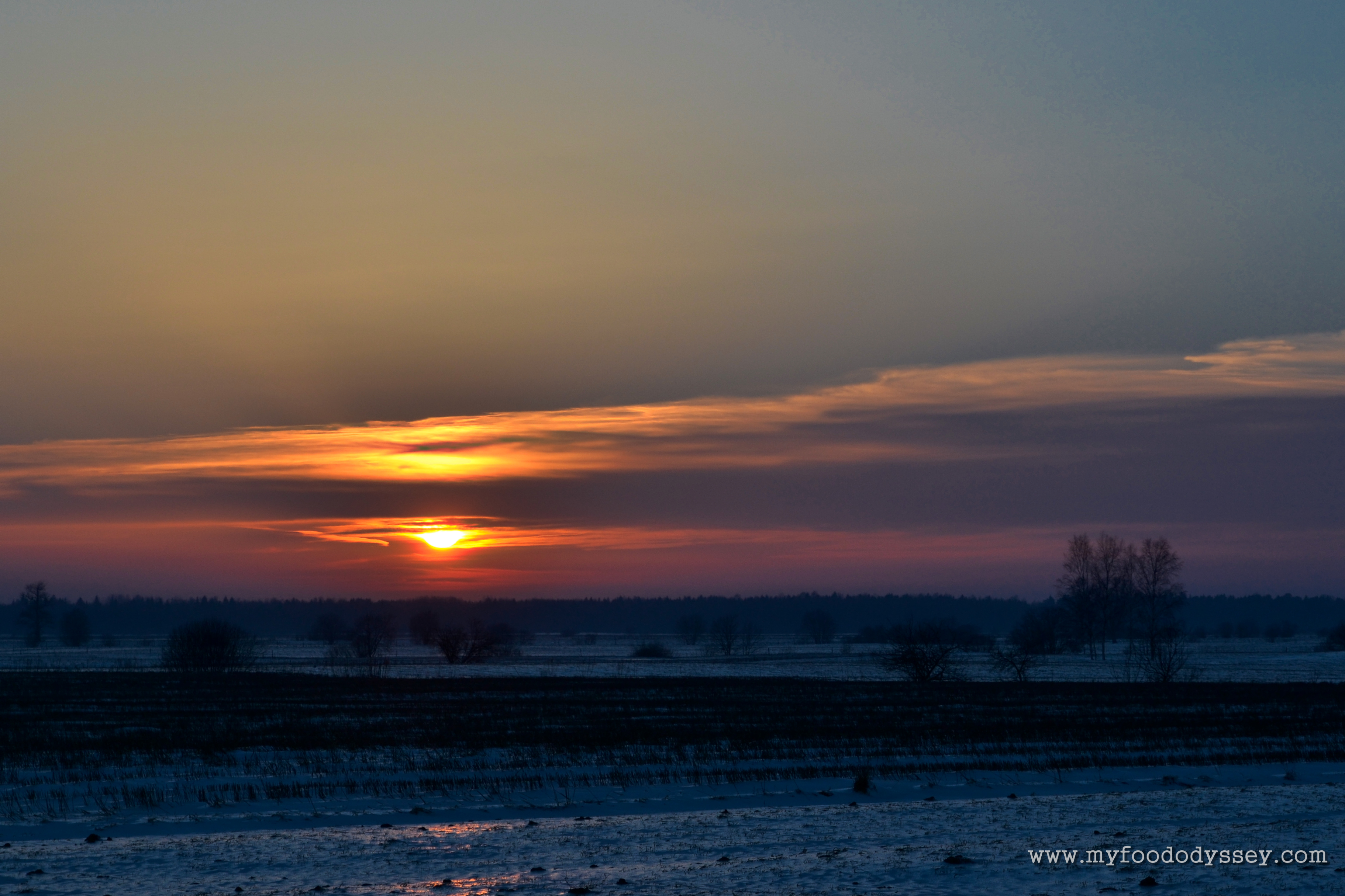
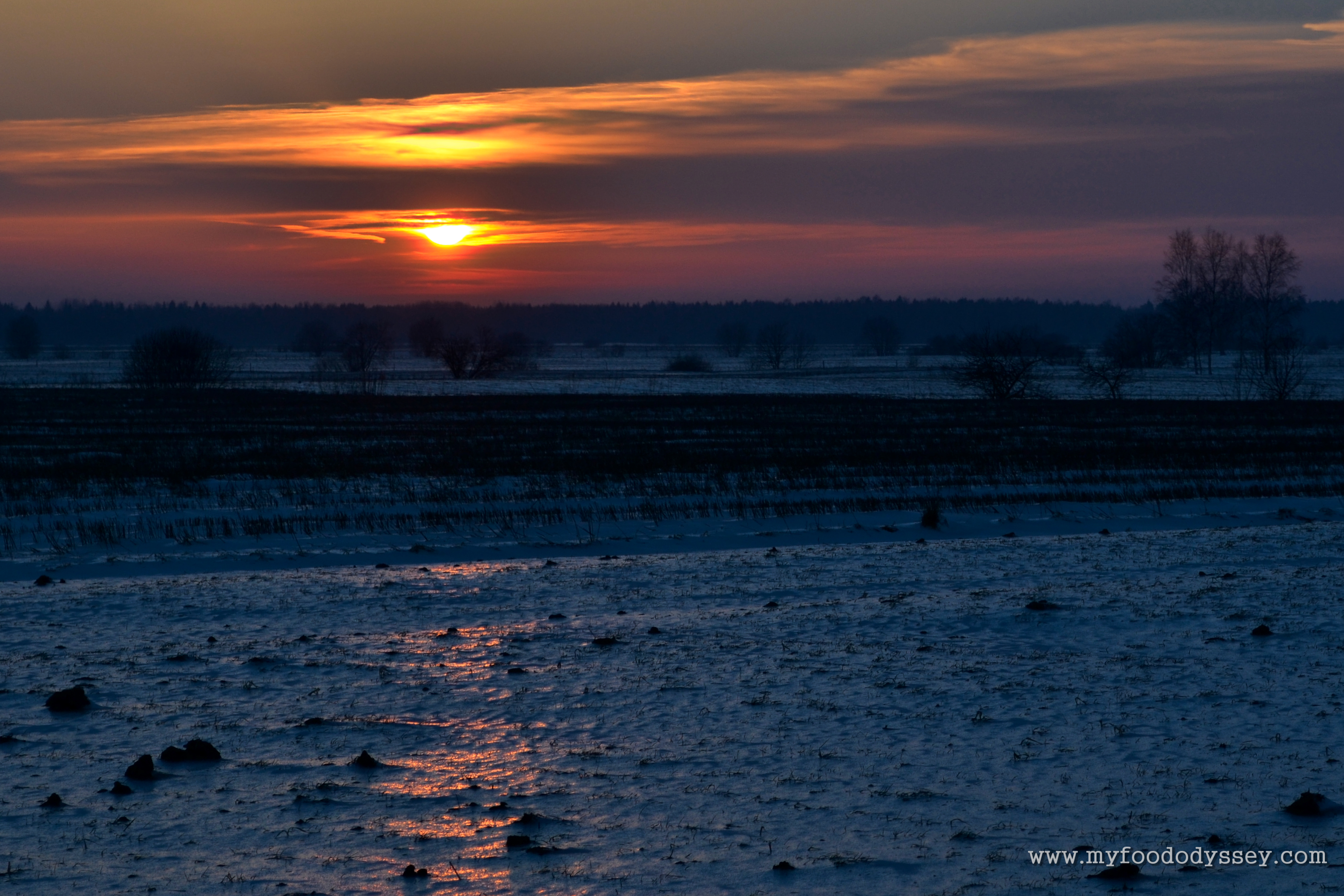
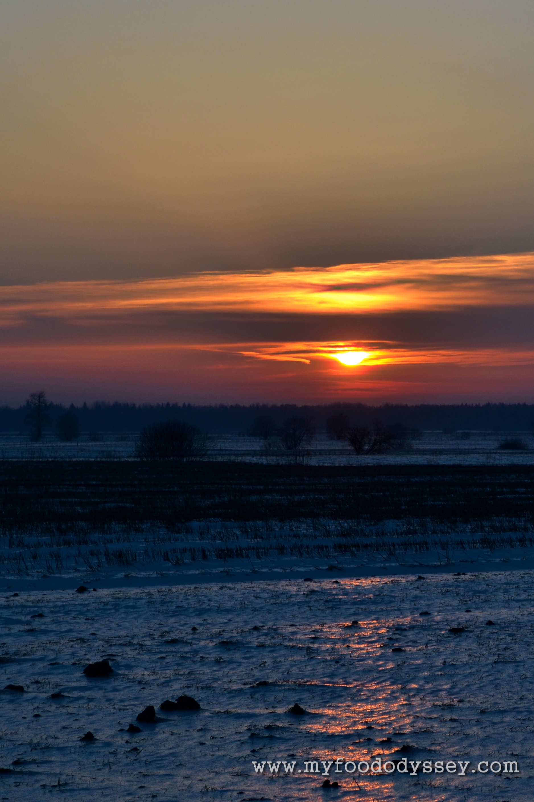
Photo 3:
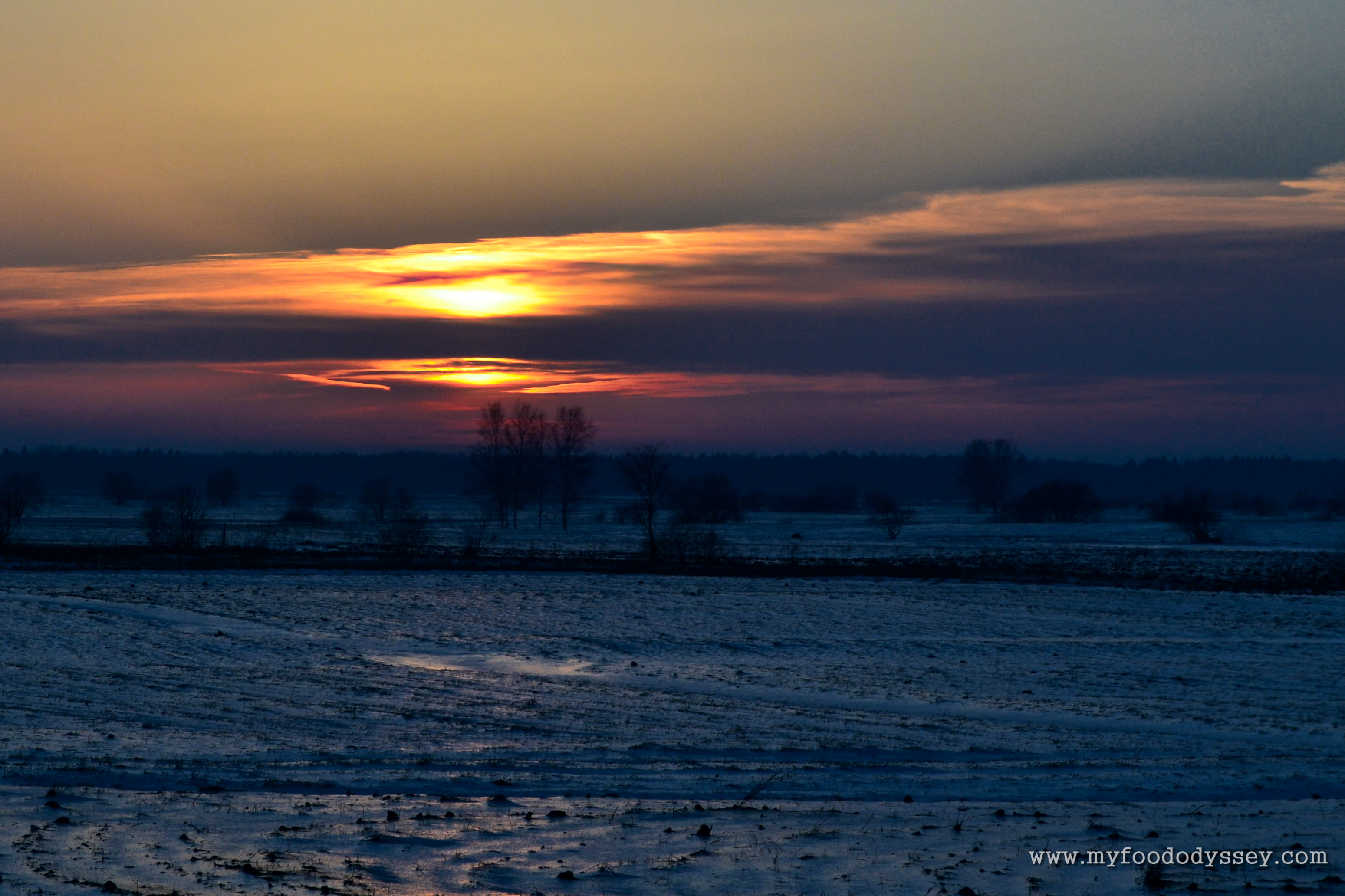
In this photo the horizon is centered and the sun is positioned across the left vertical.
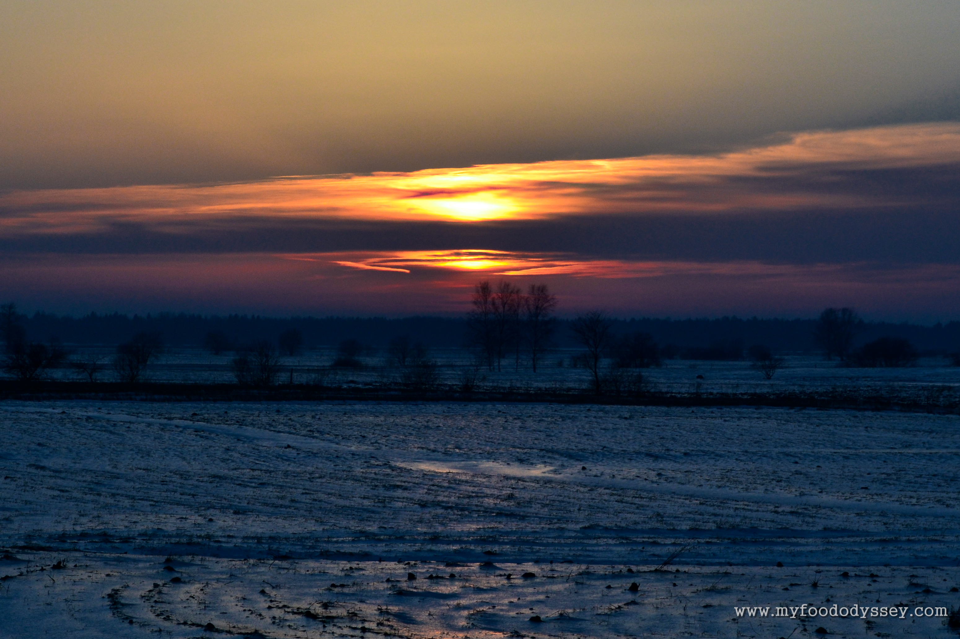
In this version the sun is centered. I can’t decide which I prefer.


Thank you, I really enjoyed that tutorial. I would love to try it out. I saved it.
LikeLiked by 1 person
You’re welcome, Sarah. I hope you enjoy experimenting and get some gorgeous photos!
LikeLike
Rules are important, of course but breaking them has it’s importance too (notwithstanding breaking the law or hurting anything, naturally) … I loved looking at these sunsets and I really enjoyed the explanation and the subsequent playing with the sunset … a lovely peaceful few minutes 🙂
LikeLiked by 1 person
Thanks Osyth – delighted you liked them!
LikeLiked by 1 person
Hi June, I totally agree with your assessments of Photo 1 and 2. For photo #3, I prefer the sun at the left vertical. Nice work! I enjoyed just taking a moment to ponder some sunsets. By the way, welcome home!
LikeLiked by 1 person
Thanks Susan! I’m leaning towards the one with the sun on the left for photo 3 myself. Somehow the sun seems to “pop” more. There’s a tranquility to sunsets that I love. I need to take more photos of them!
LikeLike
I always follow my rule. Which is that a good photo must have cake in it. Preferably right, left and centre.
LikeLiked by 4 people
Touché!
LikeLike
I knew we’d be on the same page on this one 🙂
LikeLiked by 1 person